

Author: Daniel Croft
Daniel Croft is an experienced continuous improvement manager with a Lean Six Sigma Black Belt and a Bachelor's degree in Business Management. With more than ten years of experience applying his skills across various industries, Daniel specializes in optimizing processes and improving efficiency. His approach combines practical experience with a deep understanding of business fundamentals to drive meaningful change.
Control charts stand as a pivotal element in the realm of statistical process control (SPC), a key component in quality management and process optimization. These charts offer a visual representation of process performance over time, plotting measured data points to track variations, identify abnormalities, and discern trends.
Their primary function is to highlight uncontrolled variations which are deviations from the norm often attributed to external factors. This insightful identification is crucial in determining whether a process is stable and predictable, or in need of refinement. Developed in the 1920s by Walter A. Shewhart, control charts have revolutionized the ability to distinguish between common and special cause variations, enhancing the precision of process evaluation and improvement.
Control charts are key statistical tools used in statistical process control (SPC), which is used for quality management and process optimization. Control charts are used as a way to display the performance of a process over time. This is done by plotting the measured output data points on a chart, allowing those viewing them to track how a process varies over time and identify any abnormalities, special-cause variation, or trends. The main reason control charts are used is to highlight any uncontrolled variations; these are variations that are outside the normal operation and can be the result of external or special factors. This identification helps in understanding if a process is stable and predictable or if it requires action for improvement.
Control charts were introduced by Walter A. Shewhart in the 1920s, bringing about a significant advancement in quality control. The main concept of control charts is being able to distinguish between common and special cause variations.
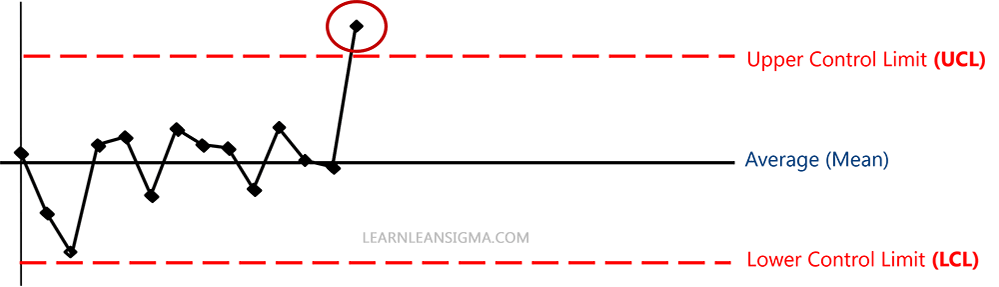
Common Cause Variation: This type of variation is inherent to the process. It’s the “noise” within the system, caused by factors that are usually consistent and predictable over time. This can be seen as the variation that appears inside the upper and lower control limits on the chart above.
Special Cause Variation: In contrast, this variation arises from external factors and is not part of the usual process. It indicates issues that need to be addressed to maintain the quality and consistency of the process. These can be seen with data points that appear outside of the upper and lower control limits.
By effectively identifying these variations, organizations can pinpoint areas requiring improvement and work towards enhancing their overall process stability and quality.
Control charts are categorized based on the nature of the data they manage – variable (quantitative) or attribute (qualitative).
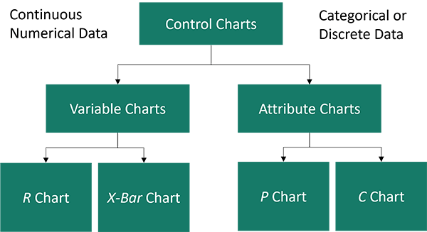
Variable Data Control Charts: These charts are designed for data that can be measured on a continuous scale, such as time, weight, distance, or temperature. They’re ideal for tracking changes in the mean, or variability, of a process. The most common types are:
Attribute Data Control Charts: These charts are used for data that are not measured but counted, typically focusing on items that are either conforming or non-conforming. They include:
P Chart (Proportion Chart): Used to track the proportion of defective items in a sample. It’s useful when the sample size varies and the data is expressed as a proportion.
C Chart (Count Chart): This chart is used to monitor the count of defects or nonconformities in an item or a unit. It’s useful when the number of opportunities for defects is constant.
A control chart is more than just a line graph; it’s a sophisticated tool designed for process monitoring and improvement. Understanding its components is key to leveraging its full potential:

To create a control chart, you first need data. You may already have this data, but consider that it needs to be gathered sequentially over a set period to reflect the process’s typical operation. It is also important that the data be as accurate and unbiased as possible.
When constructing a control chart, the amount of data collected is crucial and should be tailored to the specifics of the process. For most situations, gathering at least 20-25 subgroups, each with 4-5 individual measurements, is a good starting point. In total, aim for a minimum of 100 data points to establish a reliable baseline.
The data should be collected consistently over time, with the frequency and volume adjusted based on the process’s stability and output rate. It’s important to balance the need for precision and confidence in the results with the practicality of data collection. As you gain more insights into the process, be prepared to adapt your data collection strategy to ensure it adequately reflects the process’s variability and your analysis needs.
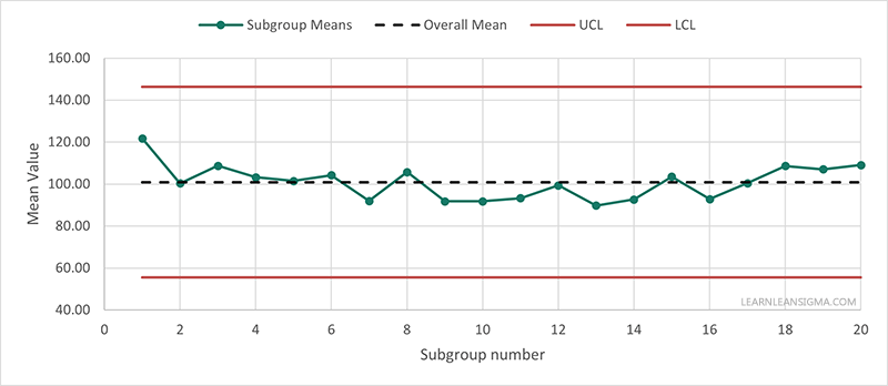
The next step is to establish a baseline for the process’s performance. The centerline is usually the mean (average) of the data set. The mean is calculated by adding all of the data points and dividing by the number of data points. This line will then be used as a reference point to compare individual data points and indicate the average performance of the process.

 Next, we need to determine the control limits (boundaries of expected process variation). Control limits are set at three standard deviations (σ) from the mean. If you are not sure how to calculate the standard deviation, take a look at our standard deviation guide, as it is key to creating and understanding control charts. You can also use our standard deviation calculator for a quick answer to calculating the standard deviation, which you can multiply by three.
To calculate control limits for a control chart, first determine the process mean and standard deviation from your data. For example, if your process mean (average) is 50 and the standard deviation is 5, the Upper Control Limit (UCL) is calculated as the mean plus three times the standard deviation (3 x 5 = 15), therefore (50 + 35 = 65), and the Lower Control Limit (LCL) as the mean minus three times the standard deviation (50 – 35 = 35). These limits represent the boundary of normal variation for a process in control. Data points outside these limits suggest special-cause variations, indicating a process that may be out of control.

Once you have your data and have calculated the mean, the standard deviation, and the control limits, the next step is to plot the chart. You can create a control chart in Microsoft Excel by setting your data out like in the example image and following these steps
Alternatively, you can try our Control Chart analyzer tool, which will allow you to upload your data and get instant detailed analysis of observations and feedback of your data. Just like in the example below
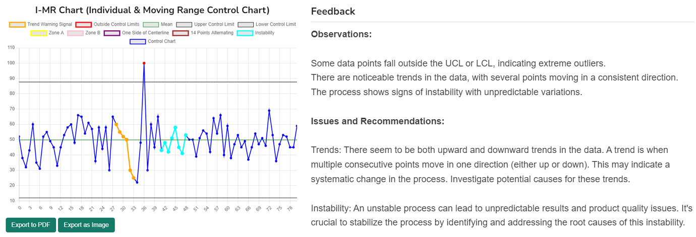
The final step involves analyzing the control chart. Interpreting a control chart involves closely examining it for data points that fall outside the established control limits or for specific patterns within these limits. Data points beyond the control limits are indicators of special cause variations, signifying an anomaly in the process that may require investigation. Additionally, even if points are within the control limits, certain patterns, such as consistent upward or downward trends, cycles, or too much clustering, can signal underlying issues. These patterns might point to potential areas for process improvement, highlighting the need for further analysis to understand and address the root causes.
Control charts are indispensable in the toolkit of quality control, providing a systematic and visual approach to monitoring process stability and identifying areas for improvement. By plotting data points, establishing a center line, setting control limits, and interpreting the resulting chart, these tools enable the detection of special cause variations and the observation of patterns such as shifts, trends, and cycles.
Through careful analysis and subsequent actions based on these insights, control charts empower organizations to proactively address underlying issues, optimize processes, and maintain high-quality standards. The ultimate goal is not just to identify and rectify problems but to foster an environment of continuous process improvement and sustained operational excellence.
A: A control chart is a statistical tool used to monitor and analyze a process over time. It helps determine if a process is in control or if there are any special causes of variation present.
A: A control chart consists of a graph with data points plotted over time. It typically includes a centerline representing the process average and control limits that define the acceptable range of variation. Data points falling within the control limits indicate that the process is stable, while points outside the limits may suggest the presence of special causes of variation.
A: Control charts provide several benefits, including:
A: There are various types of control charts, including:
A: When interpreting a control chart, the following guidelines are generally followed:
A: “Common cause” refers to the natural variation that is inherent in a process and expected to occur randomly. It is also known as “normal” or “chance” cause variation. Control charts help identify and quantify this type of variation.
“Special cause” refers to unusual or non-random sources of variation that are not inherent to the process. These causes are typically assignable to specific factors or events and can lead to unexpected changes in the process output. Control charts help detect and investigate these special causes so that appropriate actions can be taken.
A: Yes, control charts can be used in various industries and processes where data is collected over time. They are commonly applied in manufacturing, healthcare, finance, software development, and service industries to monitor and improve process performance.
A: Control charts have a few limitations, including:
A: Yes, there are many software tools available that can help create and analyze control charts. Some popular options include Minitab, JMP, Excel with add-ins like QI Macros, and various statistical software packages like R and Python that have control chart libraries and functions. These tools make it easier to plot control charts, calculate control limits, and perform statistical analyses.

Hi im Daniel continuous improvement manager with a Black Belt in Lean Six Sigma and over 10 years of real-world experience across a range sectors, I have a passion for optimizing processes and creating a culture of efficiency. I wanted to create Learn Lean Siigma to be a platform dedicated to Lean Six Sigma and process improvement insights and provide all the guides, tools, techniques and templates I looked for in one place as someone new to the world of Lean Six Sigma and Continuous improvement.

Improve your Lean Six Sigma projects with our free templates. They're designed to make implementation and management easier, helping you achieve better results.