What is Fishbone Diagram

Guide: Fishbone Diagram

Author's Avatar

Daniel Croft

Daniel Croft is an experienced continuous improvement manager with a Lean Six Sigma Black Belt and a Bachelor's degree in Business Management. With more than ten years of experience applying his skills across various industries, Daniel specializes in optimizing processes and improving efficiency. His approach combines practical experience with a deep understanding of business fundamentals to drive meaningful change.

The Fishbone Diagram, also known by various other names such as Ishikawa Diagram, Cause and Effect Diagram or 6Ms, is a visual tool used in problem-solving and root cause analysis. Originating from the quality management sector, it is used as a systematic approach to identify, explore, and display possible causes of a specific problem.

Table of Contents

What is a Fishbone Diagram?

The Fishbone Diagram is a graphical tool used for identifying and organizing possible causes of a specific problem or outcome. The diagram resembles the skeletal structure of a fish, hence its name. At the “head” of the fish is the problem you’re trying to solve, and the “bones” branching off the spine are the multiple potential causes contributing to that problem.

The benefit of a Fishbone Diagram lies in its simplicity. It gives you a structured way to brainstorm and categorize the various factors affecting a specific issue. The diagram can get as detailed as you need it to be, allowing for sub-causes to branch off the main causes, offering even deeper insights.

The Components of a Fishbone Diagram

Head: The fish’s head represents the problem or effect you’re analyzing.

Spine: The long, horizontal line connecting to the head serves as the timeline or sequence of the problem.

Bones: These are the categories of potential causes. They branch off the spine, leading towards the head.

Sub-Bones: These are the more specific factors or sub-causes that stem from the main categories.

Fishbone diagram Lean Six SIgma Tool Ishikawa Diagrams Root Cause Analysis (RCA) Fish Bone Diagram Ishikawa Diagram Cause and Effect Diagram

Why Use a Fishbone Diagram?

The Fishbone Diagram is a flexible tool that can be used for a range of applications. Here’s why it’s so useful:

1. Easy Visualization:

One of the primary advantages of using a Fishbone Diagram is its ability to simplify complex problems. With all potential causes visually represented in one place, it becomes easier to analyze and discuss the issues.

2. Team Collaboration:

The Fishbone Diagram is excellent for brainstorming sessions. It encourages team members to think critically and contributes to a shared understanding of the problem. It’s collaborative by design, allowing for the collective intelligence of the group to shine.

3. Root Cause Analysis:

Identifying symptoms of a problem is one thing; uncovering the root cause is another. The Fishbone Diagram excels at this by forcing you to dig deep into various contributing factors. By isolating these causes, you’re better positioned to find a lasting solution.

By using a Fishbone Diagram, you’re not just addressing a problem with a short-term fix; you’re conducting a thorough investigation to eliminate issues from the root up.

How to Create a Fishbone Diagram: A Detailed Guide

Creating a Fishbone Diagram might seem like a daunting task, but it’s actually a straightforward process. Here, we’ll break down each step in detail to ensure you can construct a Fishbone Diagram that serves its purpose effectively.

Materials You’ll Need:

  1. A whiteboard or large sheet of paper
  2. Markers or pens
  3. Sticky notes (optional)
  4. A team of people for brainstorming

Step 1: Identify the Problem

The first and most crucial step is to clearly identify the problem you’re trying to solve. This statement should be specific and concise. Write this problem statement at the far right side of your whiteboard or paper, as it will serve as the “head” of your fishbone diagram.

Tips:

  • Use data to define the problem whenever possible.
  • Make sure the problem is mutually understood and agreed upon by all team members.

Step 2: Determine the Main Categories

Now, draw a horizontal line from the problem statement towards the left side of the board. This is the “spine” of your fish. Next, you’ll identify the major categories of causes that could be contributing to the problem. These categories will serve as the main “bones” branching off from the spine.

Common categories often include:

  • Measurement
  • Method
  • Personel
  • Environment
  • Machine
  • Material

Tips:

  • The categories can be industry-specific or general, depending on the problem you’re analyzing.
  • Aim for 4-6 main categories for better manageability.

Step 3: Brainstorm Causes

Once you’ve determined the main categories, it’s time to brainstorm potential causes for each category. These causes will be the smaller “bones” that branch off from the main bones. If you’re working with a team, this is an excellent time for a brainstorming session.

Tips:

  • Use sticky notes to write down ideas so you can easily move them around.
  • Encourage every team member to contribute; sometimes the most unexpected insights come from diverse perspectives.

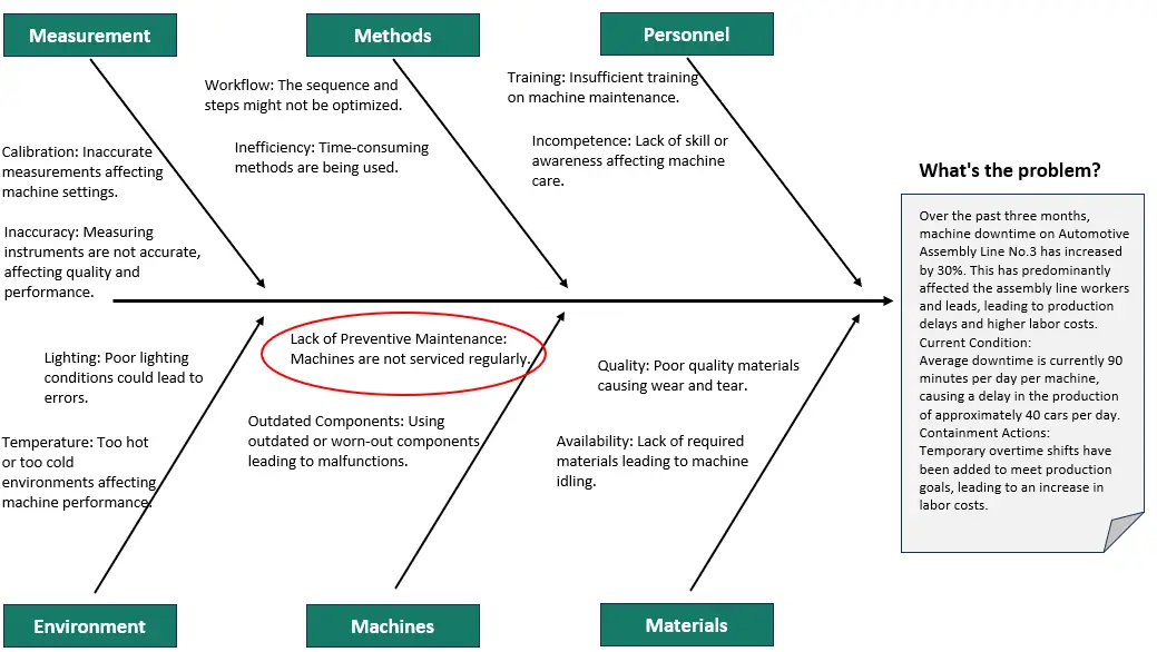
The output of the root cause analysis at this point may look something like the below example. With the lack of preventative maintenance being explored with the 5Whys analysis.

A3 Structured Problem Solving - Step 3 - Fishbone Diagram

Step 4: Dig Deeper with Sub-Causes

Sometimes, the primary causes can be broken down into smaller, more specific sub-causes. This is where the “5 Whys” technique can be beneficial. For each primary cause, ask “Why?” up to five times to dig deeper into the root of the issue.

5 Whys Analysis Tree

Tips:

  • Not all primary causes will need sub-causes; use your discretion.
  • Keep the diagram organized to ensure readability.

Step 5: Analyze and Take Action

After all the causes and sub-causes have been identified, it’s time to analyze the Fishbone Diagram as a team. Highlight or circle the causes that seem most likely to be contributing to the problem. These are the areas that will need immediate attention and action.

Tips:

  • Use data or evidence to support your conclusions.
  • Create an action plan assigning responsibility for each highlighted cause.

And there you have it! You’ve successfully created a Fishbone Diagram that will help you get to the root of your problem.

Examples and Case Studies: Understanding Fishbone Diagrams in Action

Case Study: Manufacturing Unit with Quality Issues

Imagine you run a manufacturing unit, and you’ve been receiving complaints about the quality of your products. You decide to use a Fishbone Diagram to get to the root of the issue.

Step 1: Identify the Problem
Problem Statement: “High number of defective products in the last quarter.”

Step 2: Main Categories

  • People
  • Process
  • Equipment
  • Environment

Step 3: Brainstorm Causes

  • People: Untrained staff, high employee turnover
  • Process: Inconsistent quality checks, outdated SOPs (Standard Operating Procedures)
  • Equipment: Aged machinery, lack of maintenance
  • Environment: Poor lighting, extreme temperature fluctuations

Step 4: Dig Deeper (5 Whys)

  • Untrained Staff: Why? No formal training program.
  • Aged Machinery: Why? No budget allocated for equipment upgrades.

Step 5: Analyze and Take Action

After analyzing the Fishbone Diagram, you realize that untrained staff and aged machinery are your primary culprits. Your next steps could involve investing in staff training programs and allocating budget for machinery upgrades.

By following these steps, you can develop targeted strategies to improve product quality significantly.

Common Mistakes and Tips: How to Make the Most of Your Fishbone Diagram

1. Overlooking Minor Causes

While it’s easy to focus on the most glaring issues, minor causes can accumulate and have a significant impact.

Tip: Don’t disregard a cause just because it seems minor. Sometimes, fixing smaller issues can lead to big improvements.

2. Ignoring Data

It’s tempting to rely solely on brainstorming and intuition, but data should be your guiding star.

Tip: Use metrics and KPIs to support or refute the causes you’ve identified. This adds credibility to your findings and helps you prioritize effectively.

3. Stopping at Symptoms

Identifying symptoms is just the first step; your ultimate goal should be to uncover the root causes.

Tip: Use techniques like the “5 Whys” to dig deeper into each cause and ensure you’re addressing the root of the issue, not just its manifestations.

Conclusion

Fishbone Diagrams are a fantastic asset in the toolbox of anyone interested in continuous improvement. Whether you’re a seasoned professional or just getting started, this simple yet powerful tool can help you dissect complex problems and develop targeted solutions.

They encourage you to look beyond the obvious and delve into the intricacies that contribute to each problem. So go ahead, grab that pen and paper (or a whiteboard, if you’re feeling fancy), and start your journey towards effective problem-solving.

References

A: The Fishbone Diagram was originally developed by Dr. Kaoru Ishikawa, a Japanese quality control statistician, in the 1960s. It’s also sometimes referred to as the Ishikawa Diagram in his honor.

A: Absolutely! While Fishbone Diagrams are popular in manufacturing and quality management, their application is not limited to these areas. They can be used in healthcare, software development, event planning, and even for personal problem-solving.

A: The number of main categories can vary depending on the complexity of the problem. However, it’s generally advisable to have between 4-6 main categories for easier analysis and readability.

A: Yes, there are several software tools available for creating Fishbone Diagrams, such as Microsoft Visio, Lucidchart, and various other project management software options. However, a simple pen and paper or a whiteboard can be just as effective for smaller teams or simpler problems.

A: After creating your Fishbone Diagram, you should analyze it with your team to identify the most likely root causes of the problem. Using data to support your conclusions can be very helpful. You may also employ techniques like the Pareto Analysis to prioritize causes based on their impact.

Author

Daniel Croft

Daniel Croft

Daniel Croft is a seasoned continuous improvement manager with a Black Belt in Lean Six Sigma. With over 10 years of real-world application experience across diverse sectors, Daniel has a passion for optimizing processes and fostering a culture of efficiency. He's not just a practitioner but also an avid learner, constantly seeking to expand his knowledge. Outside of his professional life, Daniel has a keen Investing, statistics and knowledge-sharing, which led him to create the website learnleansigma.com, a platform dedicated to Lean Six Sigma and process improvement insights.

All Posts

Free Lean Six Sigma Templates

Improve your Lean Six Sigma projects with our free templates. They're designed to make implementation and management easier, helping you achieve better results.

Other Guides