Scatter Plot Template

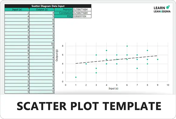
This template visualizes the relationship between two numerical variables to identify correlations. Use it to spot outliers, test hypotheses, and confirm root causes during your project's data analysis.

★★★★★
4.0 347 reviews
3K + Downloads
Updated December 2025
Template Hero

About this Template

The Scatter Plot is a fundamental data visualization tool used to investigate the relationship between two numerical variables. It plots data points on an X and Y axis to reveal patterns, trends, or correlations.

This tool is essential during the Analyze Phase of DMAIC. It helps teams answer the critical question: "Does Factor A impact Factor B?" (e.g., "Does temperature affect drying time?").

Use this template to test hypotheses, identify outliers, and provide visual evidence of root causes before moving to the Improve phase.

Pro Tip: Remember that correlation does not imply causation. A strong relationship on a scatter plot is a clue to investigate further, not proof that one variable causes the other to change.

Variable X (Input) Variable Y (Output) Outlier Positive Correlation

Correlation Analysis

Visually determine if variables are related. Identify Positive (both increase), Negative (one decreases), or No Correlation.

Spot Outliers

Easily identify data points that deviate significantly from the norm. These outliers often hold the key to understanding process defects.

Hypothesis Testing

Move beyond gut feelings. Use the Scatter Plot to validate theories about cause-and-effect relationships with real data.

Trend Identification

See the direction and strength of relationships instantly. Add a trendline (regression line) to forecast future process behavior.

FREE

Join the 28-Day Lean Challenge

Take your skills to the next level. Join 15,000+ practitioners and get exclusive tools delivered to your inbox.

Daily Lessons 5 Bonus Templates PDF Guides
Start the Challenge

No spam. Unsubscribe anytime.

The 6-Step Analysis Cycle

A systematic framework to collect data, visualize relationships, and interpret correlations between variables. This process validates root causes with evidence.

Step 01

Identify Variables

Define what you want to test. Select your Independent Variable (Cause/Input) and Dependent Variable (Effect/Output). Ensure both are measurable numerical data.

Example:

Input (X): Temperature. Output (Y): Drying Time.

X Y DATA PAIRS
Step 02

Collect & Scale

Gather at least 30-50 paired data points. Set up your axes: Independent variable on the X-axis (horizontal) and Dependent on the Y-axis (vertical). Scale them to fit your data range.

  • X-Axis: Controlled variable (Input).
  • Y-Axis: Observed result (Output).
Y X
Step 03

Plot the Points

Plot each data pair as a single dot on the graph. Do not connect the dots. The resulting "cloud" of points will begin to reveal the nature of the relationship.

Tip:

Ensure data is paired correctly (e.g., sample 1 temp with sample 1 time).

Step 04

Interpret Correlation

Look at the shape of the cloud. Does it slope up (Positive)? Slope down (Negative)? Or is it a random cloud (No Correlation)?

[Image of positive vs negative vs no correlation scatter plots]
  • Strong: Points cluster tightly in a line.
  • Weak: Points are loosely scattered.
PATTERNS
Step 05

Identify Outliers

Spot points that fall far away from the main cluster. These are outliers. Investigate them immediately—they often represent errors in data collection or special causes of variation.

Action:

Verify if the outlier is real or a typo.

OUTLIER
Step 06

Draw Trend Line

If a correlation exists, draw a "Line of Best Fit" through the center of the points. This allows you to predict the value of Y for any given X and confirms the direction of the relationship.

  • Validate: Confirm root cause.
  • Predict: Estimate future results.
Analysis FAQ

Common Questions

Does correlation mean causation?

No. Just because two variables move together doesn't mean one causes the other. For example, ice cream sales and shark attacks both increase in summer, but ice cream doesn't cause shark attacks (the hidden cause is "Hot Weather").
A B ? Hidden Factor

What is a "Strong" vs. "Weak" correlation?

It refers to how tightly the data points cluster around a line.

Strong: Points form a tight, clear line (high predictive power).
Weak: Points are loosely scattered like a cloud (low predictive power).
STRONG WEAK

What is an "Outlier"?

An outlier is a data point that differs significantly from other observations. On a scatter plot, it sits far away from the main cluster of dots.

Outliers often indicate a special cause of variation, a measurement error, or a unique event worth investigating.
OUTLIER

Why use a Scatter Plot instead of a Line Chart?

Line Charts typically show trends over time (X-axis is time).

Scatter Plots compare two numerical variables (e.g., Temperature vs. Hardness) to see if they affect each other, regardless of when the data was collected.
LINE (Time) VS SCATTER (Relationship)
Free for Personal Use

Free

Instant Download • No CC Required

Download Excel
Secure SSL 256-bit Encrypted

What's Included

Free Template

Scatter Plot Template

Download Now

On this page