Pareto (80/20) Template

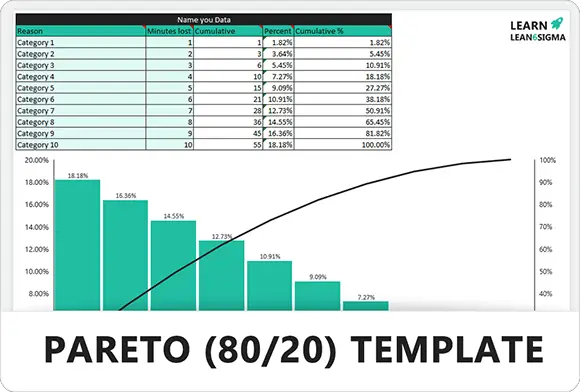
Download the Free Microsoft Excel Pareto Graphical analysis template. This template comes with all the formulas pre-created and charting to be automatically produced.

★★★★★
4.1 334 reviews
1467 Downloads
Updated January 2026
Template Hero

About this Template

The Pareto Chart is based on the famous 80/20 Rule (Pareto Principle), which states that roughly 80% of effects come from 20% of the causes. In process improvement, this means that a vast majority of your defects, costs, or delays are likely caused by just a few key issues.

This template automatically sorts your data from highest frequency to lowest and calculates the cumulative percentage line. It allows you to visually identify the "Vital Few" problems that, if solved, will yield the biggest return on investment.

Use this tool during the Analyze phase of DMAIC to narrow your focus, or in the Measure phase to baseline current performance before implementing changes.

Pro Tip: Don't stop at just one chart. If your top bar is "Machine Failure," perform a second-level Pareto analysis on just that category to drill down further (e.g., breakdown by machine type or shift).

FREQUENCY CUMULATIVE %

Focus on Impact

Separates the "Vital Few" from the "Trivial Many," ensuring your team spends energy on problems that matter.

Automated Sorting

Simply enter your raw data (categories and counts). The template automatically sorts the list and generates the chart.

Data-Driven Decisions

Moves the conversation from "I think the problem is..." to "The data shows 80% of defects are X."

Cumulative Tracking

The secondary axis shows the cumulative percentage, helping you decide exactly where to draw the line for improvement efforts.

Pareto Analysis Reference Guide

Understanding the "Vital Few" vs. the "Trivial Many" (The 80/20 Rule)

Category A: Vital Few

  • Top 20% of Causes
    These few items account for the majority of the problem.
    ~20%
  • Result Impact
    Responsible for ~80% of the defects, costs, or delays.
    ~80%
  • Action Required
    Immediate Focus. Invest resources here first for maximum ROI.

Category B: Useful Many

  • Middle 30% of Causes
    These items contribute moderately to the overall problem.
    ~30%
  • Result Impact
    Responsible for ~15% of the total effect.
    ~15%
  • Action Required
    Secondary Focus. Address these only after Category A is controlled.

Category C: Trivial Many

  • Bottom 50% of Causes
    The vast majority of items that individually matter very little.
    ~50%
  • Result Impact
    Responsible for only ~5% of the total effect.
    ~5%
  • Action Required
    Monitor Only. Generally not worth the cost to fix individually.
FREE

Join the 28-Day Lean Challenge

Take your skills to the next level. Join 15,000+ practitioners and get exclusive tools delivered to your inbox.

Daily Lessons 5 Bonus Templates PDF Guides
Start the Challenge

No spam. Unsubscribe anytime.

How to Perform a Pareto Analysis

Identify the "Vital Few" from the "Trivial Many" to maximize your improvement efforts. Follow this 4-step workflow.

Step 01

Collect & Categorize Data

Begin by gathering raw data on the problem you are investigating (e.g., defects, downtime, customer complaints). Group this data into logical categories.

  • Timeframe: Define a specific period (e.g., last quarter).
  • Categories: Group by defect type, machine, location, or reason code.
  • Measurement: Decide on frequency (count) or cost (impact).
Tip:

Don't mix apples and oranges. Ensure all data points use the same unit of measure.

Step 02

Sort by Frequency

Arrange your categories from the highest frequency (or highest cost) to the lowest. This sorting is critical for visualizing the "80/20" split.

  • Ranking: The biggest bar goes on the far left.
  • "Other" Category: Combine tiny, insignificant categories into a single "Other" bar at the far right.
Why sort?

It instantly highlights which single category contributes the most to the problem.

Step 03

Calculate Cumulative Percentage

Calculate the percentage each category contributes to the total, then create a running total (cumulative). This line graph helps you find the cutoff point where 80% of the impact is achieved.

  • Total: Sum of all occurrences.
  • Individual %: (Category Count / Total) × 100.
  • Cumulative %: Running total of individual percentages.
100%
Step 04

Identify the "Vital Few"

Look for the "elbow" in the chart where the cumulative line flattens out. Focus your root cause analysis (5 Whys, Fishbone) on the top 1 or 2 categories on the left[Image of Pareto chart showing 80/20 distribution] .

  • Focus: Ignore the "Trivial Many" on the right for now.
  • Action: Assign teams to solve the top issues.
  • Verify: Re-run the Pareto chart later to confirm the bar has shrunk.
Result:

Maximum impact with minimum effort (Working smarter, not harder).

VITAL TRIVIAL MANY
FAQ

Common Questions

What is the difference between a Bar Chart and a Pareto Chart?

[Image of Pareto chart showing 80/20 distribution]While both use bars to represent data, a Pareto Chart strictly orders the bars from highest to lowest frequency. It also includes a secondary axis with a cumulative percentage line, specifically to highlight the "80/20" relationship (the Vital Few vs. Trivial Many).

When should I use a Pareto Chart?

Use it early in the problem-solving process (the Analyze phase of DMAIC) when you have raw data on defects or complaints but don't know where to focus. It helps you avoid "boiling the ocean" by identifying the 20% of causes that are generating 80% of your problems.

Should I measure by Frequency (Count) or Cost ($)?

Ideally, do both. Sometimes a defect happens frequently (high count) but is cheap to fix (low cost). Conversely, a rare defect might be catastrophically expensive. Creating two Pareto charts—one for Frequency and one for Cost—gives you the complete picture for decision-making.

What if my chart doesn't show the 80/20 split?

If all your bars are roughly equal height (a "flat" Pareto), it means there is no clear priority. In this case, try re-categorizing your data. For example, instead of grouping by "Defect Type," try grouping by "Machine," "Shift," or "Operator" to see if a clear pattern emerges.

What is a "Weighted" Pareto?

A weighted Pareto multiplies the frequency by a severity factor (like cost, time, or safety risk). For example: 100 Minor Scratches (weight 1) vs. 1 Engine Failure (weight 500). This ensures you prioritize issues based on true impact, not just how often they happen.
Free for Personal Use

Free

Instant Download • No CC Required

Download Excel
Secure SSL 256-bit Encrypted

What's Included

Free Template

Pareto (80/20) Template

Download Now

On this page