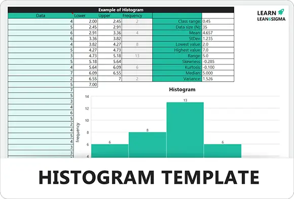
Histogram Template
Visualize frequency distributions and analyze data patterns effectively with this Histogram Template. It helps identify process variations, allowing teams to drive informed, data-backed quality control improvements.
★★★★★
3.8 113 reviews ↓ 1K + Downloads
↻ Updated December 2025

About this Template
The Histogram is a fundamental tool for visualizing the frequency distribution of continuous data. It groups data points into user-specified ranges (bins) to reveal patterns that simple averages might miss.
This tool is essential in the Measure and Analyze Phases. It helps teams understand process variation, identify outliers, and determine if data is normally distributed (Bell Curve).
Use this template to validate process capability, spot centering issues, and communicate data distribution clearly to stakeholders.
Pro Tip: The number of bars (bins) matters. Too few bins hide details; too many bins make the data look like noise. A good rule of thumb is to use the square root of the number of data points.
Visualize Variation
Instantly see the spread (width) of your data. Understand if your process is consistent or highly variable.
Check Centering
Identify the central tendency (Mean, Median, Mode). Is the process centered on the target value?
Spot Outliers
Detect data points that fall far outside the normal range, indicating potential errors or special cause variation.
Analyze Distribution
Determine the shape of the data (Normal, Skewed Left/Right, Bimodal) to select the correct statistical tests.
Perfect For
Process Capability Data Analysis Six Sigma Frequency Distribution Quality Control
FREE
Join the 28-Day Lean Challenge
Take your skills to the next level. Join 15,000+ practitioners and get exclusive tools delivered to your inbox.
Daily Lessons 5 Bonus Templates PDF Guides
Start the Challenge
No spam. Unsubscribe anytime.
Histogram Creation Process
A step-by-step guide to transforming raw data into a visual frequency distribution. This reveals process variation and capability.
Step 01
Collect Data
Gather continuous data (e.g., time, weight, length) from the process. Ensure the sample size is sufficient (usually n > 50) to see a pattern.
Requirement:
At least 50-100 data points for accuracy.
Step 02
Determine Bins (Intervals)
Calculate the range (Max - Min) and divide it into equal intervals or "bins." The number of bins determines the resolution of your chart.
- Rule of Thumb: Square root of sample size (n).
- Example: For 100 samples, use 10 bins.
Step 03
Count Frequency
Sort your data points into the bins. Count how many data points fall into each interval. This count becomes the height of your bars.
Action:
Tally the occurrences for each range.
Step 04
Plot the Bars
Draw the bars. The X-axis represents the measurement scale (bins), and the Y-axis represents the frequency (count). Bars should touch, indicating continuous data.
Step 05
Analyze the Shape
Look at the distribution. Is it Bell-shaped (Normal)? Is it Skewed to one side? Does it have two peaks (Bimodal)? The shape tells the story of the process.
Normal:
[Image of normal distribution curve]Symmetrical "Bell Curve" centered on the average.
Step 06
Interpret & Act
Check if the data spread falls within specification limits. Investigate outliers. If the process is too wide (high variation), focus on reducing variability.
- Narrow: Consistent process.
- Wide: High variation (needs control).
Histogram FAQ
Common Questions
What is "Normal Distribution"?
Normal distribution is the ideal Bell Curve shape. It means most data points are centered around the average (mean), with fewer points tapering off symmetrically towards the extremes.
This indicates a stable, predictable process with "common cause" variation.
How many "Bins" should I use?
The number of bars (bins) changes the story.
Too few bins hide details (oversimplified). Too many bins show noise (too messy).
A common rule is the Square Root Rule: If you have 100 data points, use √100 = 10 bins.
Too few bins hide details (oversimplified). Too many bins show noise (too messy).
A common rule is the Square Root Rule: If you have 100 data points, use √100 = 10 bins.
What does Skewed Data mean?
If the data "leans" to one side, it is skewed.
Skewed Right (Positive): The tail is on the right (e.g., salaries, where a few high earners pull the average up).
Skewed Left (Negative): The tail is on the left.
Skewness often indicates a natural limit (like zero) or a process shift.
Skewed Right (Positive): The tail is on the right (e.g., salaries, where a few high earners pull the average up).
Skewed Left (Negative): The tail is on the left.
Skewness often indicates a natural limit (like zero) or a process shift.
Related Templates
View Library
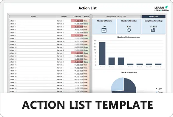
Six SigmaAction List Template
3.7
1K +
Six SigmaSIPOC Template
3.9
4K +
StrategyStakeholder Priortization Matrix Template
4.2
8k +
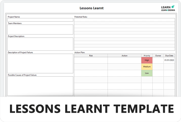
TemplateLessons Learned Template
3.8
2.5K +
PrioritisationPICK Chart Template
4.0
10K +
TemplateValue Add Analysis Template
4.7
11K +
5S5S Audit Template for Workplace Organisation & Sustainment
4.4
23K +
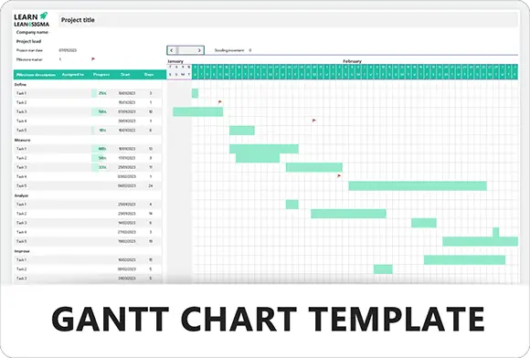
TemplateGantt Chart Template
4.1
1K +
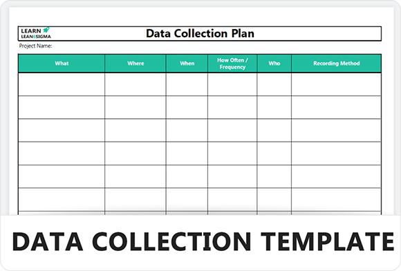
Six SigmaData Collection Plan Template
3.7
8K +
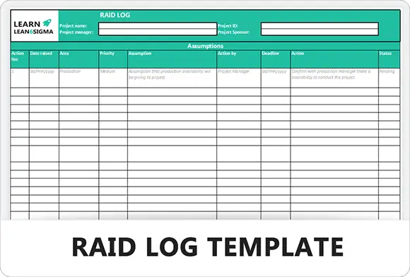
Risk ManagementRAID Log Template
4.5
65K +
TemplateStandard Work Instructions Template

4.7
83K +
PrioritisationImpact and Effort Matrix Template
3.6
5K +
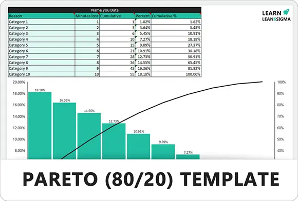
Root Cause AnalysisPareto (80/20) Template
4.1
1467
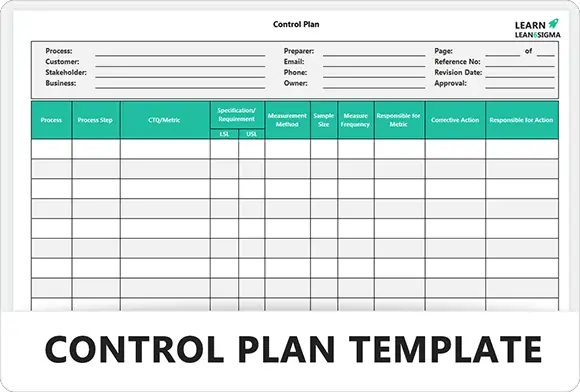
Risk ManagementControl Plan Template
4.3
4K +
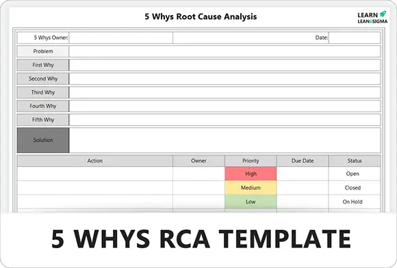
Root Cause Analysis5 Whys Template
4.2
33K +
TemplateProject Charter Template
5.0
1k+
TEMPLATEBalanced Scorecard Template
3.9
5461
Root Cause AnalysisA3 Problem Solving Template
4.7
53K +
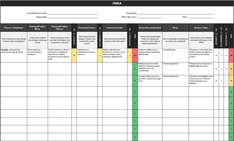
Risk ManagementFMEA Template for Risk Analysis and Failure Prevention
4.8
85k +
TemplateSWOT Analysis Template
3.8
11K +
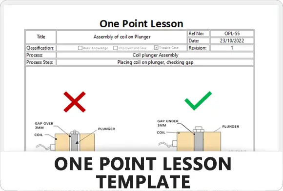
TemplateOne Point Lesson Template
4.8
12K +
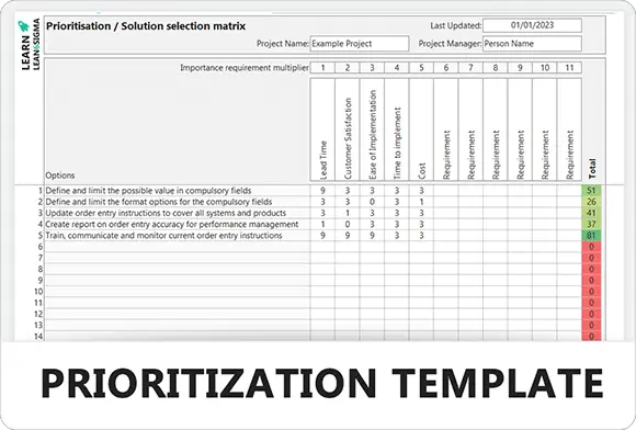
PrioritisationPrioritization Matrix Template
4.6
18K +
TEMPLATEOEE Calculator Template
4.0
1.1K +
Template8 Wastes – TIMWOODS Template
4.2
12K +
Free for Personal Use
Free
Instant Download • No CC Required
Download Excel Secure SSL 256-bit Encrypted
What's Included
Free Template
Histogram Template