Guide: Box Plots
Box plots visualise data spread with median, quartiles and outliers at a glance. They compare distributions, spotlight variation and shifts, and support Six Sigma capability studies, monitoring, and exploratory analysis.
Author: Daniel Croft
Daniel Croft is an experienced continuous improvement manager with a Lean Six Sigma Black Belt and a Bachelor's degree in Business Management. With more than ten years of experience applying his skills across various industries, Daniel specializes in optimizing processes and improving efficiency. His approach combines practical experience with a deep understanding of business fundamentals to drive meaningful change.
Box Plot TL;DR — see spread fast
- Box plot (box-and-whisker) sketches distribution shape, centre and spread in one compact graphic.
- Why use it? Instantly spots variability, skew and outliers—far quicker than raw tables.
- Ideal for: pre/post improvements, multi-line comparisons, supplier audits, DOE factor screening.
- Anatomy: median line, Q1 & Q3 box, whiskers to 1.5 × IQR, dots for outliers.
- Reading tips: overlapping medians → similar centres; long whisker → high spread; lone points → investigate.
- Toolkit: Excel template, online box-plot builder, and interpretation cheat sheet in the guide.
Box plots, or box-and-whisker plots, stand as fundamental tools in statistics and data visualization, offering a succinct yet rich depiction of a dataset’s distribution. These plots elegantly encapsulate key data points – the minimum, first quartile, median, third quartile, and maximum – providing a clear view of the data’s spread, central tendency, skewness, and potential outliers.
This exploration delves into the nuances of box plots, from their construction and interpretation to their diverse applications and inherent limitations. Essential in statistical analysis, box plots serve as a versatile instrument for initial data examination, comparison, and hypothesis formation.
What are Box Plots?
Box plots, commonly referred to as box-and-whisker plots, are an essential tool in both statistics and data visualization. Their design is elegantly simple yet packed with valuable information about a dataset’s distribution. This detailed explanation will delve into the intricacies of box plots, focusing particularly on their structure and the insights they offer.
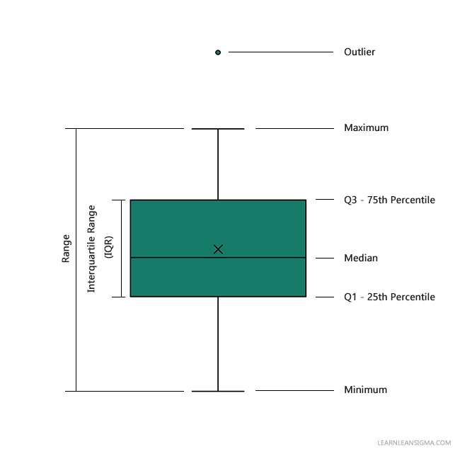
At its core, a box plot is a graphical representation of data that shows the distribution through their quartiles, highlighting the median, the spread, potential skewness, and outliers. The plot is based on a five-number summary, which includes the following key points:
Minimum: This is the lowest value in the data set, excluding any outliers. In a box plot, it is typically represented by the end of the lower whisker.
First Quartile (Q1): Also known as the lower quartile, it is the median of the lower half of the data set. This means that 25% of the data points in the dataset are less than or equal to Q1.
Median: This is the middle value when the data set is ordered from lowest to highest. The median divides the dataset into two equal halves and is a measure of central tendency.
Third Quartile (Q3): This is the upper quartile, representing the median of the upper half of the data set. It indicates that 75% of the data are less than or equal to Q3.
Maximum: This is the highest value in the data set, excluding outliers, and is marked by the end of the upper whisker in the plot.
Insights Provided by Box Plots
Box plots are revered for their ability to convey several statistical insights succinctly:
Spread of Data: The IQR, depicted by the width of the box, shows the range within which the central half of the data lies. A wider box implies greater variability in the data.
Skewness: The plot can indicate the skewness of the data. If the median is closer to Q1 or Q3, or if one whisker is significantly longer than the other, it suggests that the data is skewed either to the left or right.
Outliers: By clearly showing data points that fall outside the typical range, box plots help in identifying anomalies in the dataset.
In summary, a box plot is a versatile tool that offers a quick yet comprehensive view of the distribution characteristics of a dataset. By understanding and interpreting box plots, one can gain crucial insights into the nature of the data at hand, which is a fundamental step in any statistical analysis or data visualization endeavour.
28 Days of Lean Mastery –
Free Templates Inside
Every day you’ll get a proven Lean tool, a tip to apply it, and a downloadable template.
- ✅ Daily email with Lean tools
- ✅ Excel + printable templates
- ✅ Bite-sized lessons you can use

How to Create a Box Plot in Excel: A Step-by-Step Guide
Creating a box plot in Excel is a straightforward process that allows you to visually represent the distribution of your data. This step-by-step guide will walk you through the process of creating a box plot (also known as a box-and-whisker plot) using Microsoft Excel.
If you do not have data to pratice along with download our Demo Box Plot data.
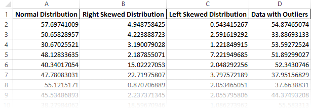
Step 1: Prepare Your Data
- Organize Your Data: Arrange your data in a single column. For comparative box plots, use multiple columns for different data sets or groups.
Step 2: Insert a Box Plot Chart
- Select Your Data: Click and drag to select the data you want to include in your box plot.
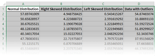
- Insert Chart: Go to the
Inserttab on the Excel ribbon. Click on theInsert Statistic Charticon and selectBox and Whisker.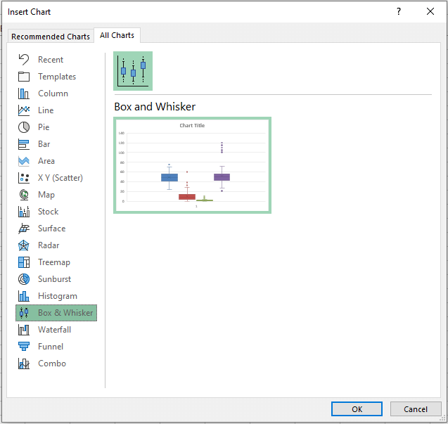
- Select Your Data: Click and drag to select the data you want to include in your box plot.
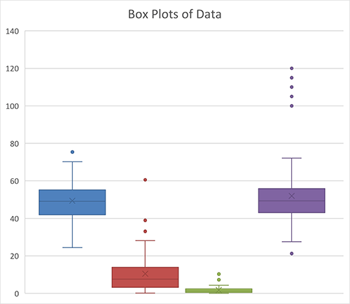
Step 3: Customize the Box Plot
- Chart Elements: Add titles, labels, or gridlines by clicking on the
Chart Elementsbutton (the plus icon next to the chart). Here, you can add a chart title, axis titles, and more. - Chart Styles: Change the visual style or color scheme of your box plot by selecting from the
Chart Stylesoptions. - Format Axes: Right-click on the axis you want to format. You can adjust scales, font, and number formats.
Step 4: Adjust Box Plot Settings
- Whisker Options: Right-click on any of the boxes in the plot and choose
Format Data Series. UnderSeries Options, you can adjust the whisker length (default is 1.5 times the interquartile range). - Show Mean Markers: In the
Format Data Seriespane, you can choose to show the mean value markers if needed.
Step 5: Analyze the Box Plot
- Interpret the Plot: Observe the median, range, interquartile range, and outliers (if any) in your data.
- Comparative Analysis: If you have multiple data sets, compare their distributions, medians, and variability.
Tips and Considerations
- Data Accuracy: Ensure your data is accurate and clean before creating the box plot.
- Outliers: Pay attention to any outliers identified by the plot for further investigation.
- Excel Versions: The steps may slightly vary depending on your version of Excel.
By following these steps, you can effectively create a box plot in Excel, providing a visual representation of your data’s distribution, which is essential for analysis and reporting.
Interpreting Box Plots
Understanding Spread and Skewness
Spread: The spread of the data is visually represented in two ways in a box plot. First, the width of the box (the IQR) shows the spread of the middle 50% of the data. Second, the length of the whiskers indicates the overall spread of the data. A wider box or longer whiskers suggest greater variability in the data.
Skewness: A box plot can give an indication of the skewness of the data. If the median line within the box is closer to Q1 or Q3, it suggests skewness (left or right respectively). Additionally, if the whiskers are of unequal lengths, it also suggests that the data might be skewed.
Identifying Outliers
Outliers: These are points that lie beyond the whiskers. They are critical in data analysis as they can indicate exceptional cases, errors in data collection, or natural but rare variations in the data. Analyzing outliers is crucial for a comprehensive understanding of the dataset.
Applications of Box Plots
Comparative Analysis
Visual Comparison: Box plots are exceptionally effective for comparing distributions across different categories or groups. When multiple box plots are aligned side-by-side, they offer a clear visual comparison. This setup makes it easy to compare central tendencies (medians), variability (interquartile ranges), and the presence and nature of outliers across different groups or categories.
Multiple Categories: In many fields such as medicine, business, or social sciences, comparing data across multiple groups is essential. For instance, a box plot can compare exam scores across different classrooms or patient recovery times across different treatment groups.
Statistical Insights
Preliminary Assessment: Box plots are often used in the preliminary stages of data analysis to gain an overview of the data’s distribution. This is crucial for deciding on the appropriate statistical tests to apply, as different tests require different assumptions about the data distribution (normal distribution, variance, etc.).
Identifying Anomalies: They are particularly useful in spotting outliers which might influence the results of statistical tests or might need special attention in further analyses.
Data Exploration
Quick Data Assessment: In exploratory data analysis, box plots provide a fast way to understand the spread, central tendency, and outliers in a dataset. This can guide further detailed analysis and help in formulating hypotheses or spotting unusual trends.
Limitations of Box Plots
Despite their usefulness, box plots are not without their limitations:
Modality: Box plots do not display the modality of the data. This means that they cannot show if the data is unimodal (one peak), bimodal (two peaks), or multimodal (more than two peaks). This is a significant limitation when the modality of the distribution is important for the analysis.
Hidden Details: Certain details of the distribution can be hidden in a box plot. For example, they do not show how the data within the quartiles is distributed. All distributions with the same quartiles and medians will have identical box plots, even if the data is distributed differently within these ranges.
Over-simplification: Sometimes, the simplicity of box plots can be a drawback. They might oversimplify complex data distributions, leading to the potential oversight of important characteristics of the data.
Want exclusive templates, tools and guides?
Join our email list below and for the next 28 days, we will send you exclusive tools, templates and guides unavailable on the website. We developed a short and simple 28-day program designed to develop your ability to implement Lean and Six Sigma methods daily.
Conclusion
In conclusion, box plots are invaluable in data analysis, adept at offering a rapid yet comprehensive view of a dataset’s distribution. They excel in comparative analysis, allow for preliminary statistical insights, and are integral to exploratory data analysis.
However, their simplicity can also be a limitation, as they do not reveal the modality of data and may obscure detailed distribution characteristics. Despite these limitations, box plots remain a staple in data visualization, providing a foundational tool for understanding and interpreting the nature of data in various fields. Their ability to condense complex data into an easily interpretable format makes them an indispensable part of any data analyst’s toolkit.
References
- McGill, R., Tukey, J.W. and Larsen, W.A., 1978. Variations of box plots. American statistician, pp.12-16.
- Spitzer, M., Wildenhain, J., Rappsilber, J. and Tyers, M., 2014. BoxPlotR: a web tool for generation of box plots. Nature methods, 11(2), pp.121-122.
Q: What is a box plot and what does it show?
A: A box plot, also known as a box-and-whisker plot, is a graphical representation of data that displays the distribution through five key statistics: the minimum, first quartile (Q1), median, third quartile (Q3), and maximum. It is used to depict the spread, central tendency, and potential outliers in a dataset.
Q: How do you interpret the whiskers in a box plot?
A: The whiskers in a box plot extend from the first quartile (Q1) and third quartile (Q3) to the minimum and maximum values in the dataset, typically within 1.5 times the interquartile range (IQR). They show the range of most of the data, with points outside the whiskers often considered outliers. The length of the whiskers can indicate the variability or spread of the data.
Q: Can box plots show the skewness of data?
A: Yes, box plots can indicate skewness in data. If the median is not centered within the box or if the whiskers are of unequal lengths, it suggests that the data is skewed. A median closer to the bottom of the box with a longer upper whisker indicates right skewness, while the opposite suggests left skewness.
Q: What are the limitations of using box plots for data analysis?
A: Box plots have limitations such as not showing the modality of data (whether it is unimodal, bimodal, or multimodal) and potentially oversimplifying complex data distributions. They do not depict how data is distributed within the quartiles and can sometimes hide important details, like clustering of data points.
Q: How are outliers represented in a box plot?
A: In a box plot, outliers are typically represented as individual points that lie beyond the whiskers. These are points that fall outside the range of 1.5 times the interquartile range (IQR) from the quartiles. Outliers are significant as they may indicate unusual variations, errors in data collection, or specific characteristics of the dataset that warrant further investigation.
Author
Daniel Croft
Daniel Croft-Bednarski is a Continuous Improvement Manager with a passion for Lean Six Sigma and continuous improvement. With years of experience in developing operational excellence, Daniel specializes in simplifying complex concepts and engaging teams to drive impactful changes. He shares his expertise through LearnLeanSigma.com, offering tools, guides, and insights to help others implement Lean methods effectively. Daniel is committed to cultivating a culture of improvement, across the industry, through practical resources, innovative strategies, and a hands-on approach to leadership.
View Posts Free Lean Six Sigma Templates
Improve your Lean Six Sigma projects with our free templates.


