Control charts are an essential tool in statistical process control. They effectively demonstrate the overall pattern and extent of variation by providing a graphical representation of how a process changes over time. But it is their ability to show if a process is stable and ‘in control’ that makes them truly powerful. In this section, we’ll look at control charts and the seven warning signs that indicate a process is out of control.
Table of Contents
What is a Control Chart?
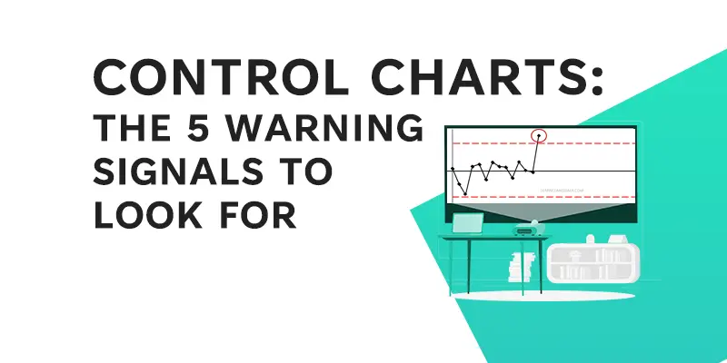
Consider a control chart to be a time-lapse photograph of a process. The x-axis represents time, while the y-axis represents the measurement of what you’re looking at, such as product quality, customer wait times, or the number of defects in a batch.

There are three primary lines on the chart: an upper control limit (UCL), a lower control limit (LCL), and an average line, also known as the centre line. Typically, the control limits are set as the average plus or minus three standard deviations. If a data point exceeds these control limits, it indicates that the process is possibly out of control, indicating the presence of unusual causes. These are exceptional events or circumstances that are not inherent in the process but have a significant impact on it.
Why are Control Charts Important?
Control charts are essential for a number of reasons. They enable teams to analyze past performance and make data-driven predictions about future performance. They can demonstrate the efficacy of a process when compared to customer specifications. Furthermore, they visually communicate a process’s stability over time and identify both common and special cause variations.
But, perhaps most importantly, control charts can alert you when your process is deviating from its intended path. Let’s take a closer look at these warning signs.
Warning Signal 1: One Point Outside the 3-Sigma Control Limits
The first, and perhaps most obvious, warning signal is a data point that exceeds the 3-sigma control limits. In other words, if any data point is above or below the UCL, it’s time to look into it.
Remember that these control limits are designed to account for the natural variability in your process. If a data point deviates from these limits, it indicates that something unusual has occurred – a “special cause.” This could be due to a variety of factors, including a material change, equipment malfunction, or a sudden change in environmental conditions.

Warning Signal 2: Nine or More Consecutive Points Above or Below the Center Line
The second warning sign is nine or more points in a row that are all above or all below the center line. This rule suggests that you make a systematic change to your process.
The process average is represented by the center line. If you have nine or more points above or below this average in a row, it’s a good indication that the process mean has shifted. While eight consecutive points on one side of the average may be cause for concern, nine points provide more conclusive evidence of a shift.

Assume you’re manufacturing light bulbs and you suddenly notice nine consecutive points above the average on your control chart tracking bulb brightness. This could indicate a change in the process, such as a change in filament material or voltage supply, resulting in brighter bulbs.
Warning Signal 3: Seven or More Consecutive Points Increasing or Decreasing
A third warning signal is triggered by an upward or downward trend of seven or more points in a row. This trend indicates that the process is drifting over time, which could be caused by a number of factors such as tool wear in manufacturing or seasonal effects in sales data.
This is statistically unlikely, consider flipping a coin that is heads and tails seven times and getting heads or tails consistently 7 times in a row, the probability is 0.00078.

For example, if you notice seven or more points in a row steadily increasing on a control chart tracking the time it takes to resolve customer support tickets, this could indicate that your support team is becoming increasingly slow. This could be because of factors such as increased ticket volume, a lack of training, or low morale.
Warning Signal 4: Fourteen or More Consecutive Points Alternating Up and Down
When fourteen or more points in a row alternate up and down, the fourth warning signal is triggered. This could indicate bias or sampling issues. In other words, your data is not random, implying that your process is not stable.

If you’re measuring the thickness of potato chips and notice fourteen or more consecutive points alternating up and down, it could indicate a problem with your cutting machine or a bias in how the thickness measurements are taken.
Warning Signal 5: Fifteen Consecutive Points within 1 Standard Deviation
The fifth warning sign occurs when fifteen consecutive points are within one standard deviation of each other (above or below the average). This could imply a decrease in common-cause variation, a change in the operational definition, corrupted data, or even a miracle!

In a call center, for example, fifteen consecutive points on a control chart monitoring call times falling within one standard deviation of the average may indicate that call times have become unusually consistent. This could be due to a change in how calls are handled, a new and more efficient script, or a problem with the time recording system.
Conclusion
Understanding these warning signs is critical if you want to make the most of your control charts. They assist you in quickly identifying when your processes may be deviating from the expected path, allowing you to address issues before they escalate. By keeping an eye out for these indicators, you can ensure that your processes run smoothly and efficiently, ultimately improving the quality of your products or services and increasing customer satisfaction.
Stay tuned for our next blog post, in which we’ll go over the remaining two control chart warning signals. Until then, continue on your path to process perfection!
References
Nelson, L.S., 1984. The Shewhart control chart—tests for special causes. Journal of quality technology, 16(4), pp.237-239.
